Beginners
5 composition mistakes every phone photographer makes
The five mistakes that turn up in 80% of phone photos, why they happen, and the specific grid or habit that fixes each one.
You can spot a phone snapshot from across the room. It's not the camera — phones are sharp, well-exposed, and color-corrected to within an inch of their lives. It's the composition. The same five mistakes show up in roughly 80% of casual phone photos, and once you've named them, you can't un-see them.
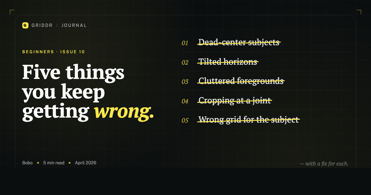
Here are the five, in order of how common they are. Each one has a specific fix.
1. The dead-center subject
The number-one mistake. Person standing in the middle of the frame. Cup centered on the table. House dead in the middle of the photo with equal sky and ground.
Centering only works for symmetric photos — reflections, faces straight on, things designed for symmetry. Everything else feels stuck. The viewer's eye lands on the subject and has nowhere to go.
Fix: Pull up the rule-of-thirds grid and put the subject on a third instead. Top-left, top-right, bottom-left, or bottom-right. Each one feels different — see the 12 examples — but any of them is better than dead center for a non-symmetric scene.
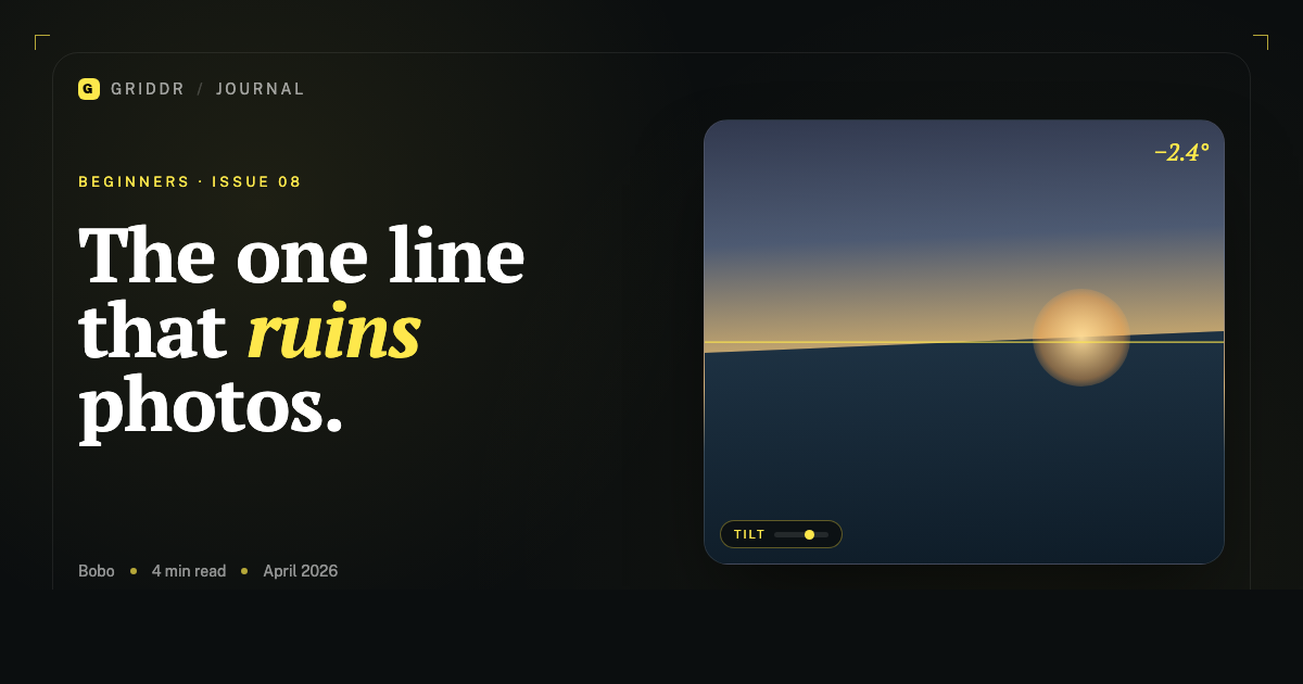
2. The tilted horizon
The most-fixable mistake. The horizon runs uphill. The wall in the background slopes down to the right. The photo otherwise might be good, but the tilt is the first thing the eye picks up, and it makes the whole shot feel sloppy.
This happens because phones are heavier on the lens side, your hands aren't symmetrical, and the horizon disappears from your conscious attention while you're focused on the subject.
Fix: Use a single horizontal grid line. Even just one. Lay it across the frame and tilt the phone until the horizon is parallel to the line. Detailed method here.
Half a degree of tilt reads as "snapshot." Fifteen degrees reads as "art." There's no readable middle.
3. The cluttered foreground
You're trying to photograph a beautiful mountain, and there's a parked car at the bottom of the frame. You're shooting your kid, and there's a half-eaten plate, a remote, and three socks behind them. The photo is fighting you.
This isn't a grid problem. It's an attention problem. Phones make it so easy to shoot that you stop looking at what's in the frame other than the subject.
Fix: Before pressing the shutter, scan the four corners of the frame in order — top-left, top-right, bottom-right, bottom-left. Anything distracting in the corners? Move. Five steps left, three steps closer, or down on one knee. Foreground clutter is almost always solved by changing your position, not by editing later.
This is the "two seconds before you press the shutter" habit that separates people who shoot 200 photos to get one good one from people who shoot 20 to get the same one.
4. The uncomfortable crop
You shot a person and cut off their feet at the ankle. You shot a building and cut off the top of the roof at the peak. You shot a face and the top of the head is gone but the chin has acres of room.
There's a rule from portrait photography: never crop at a joint. Not the wrist, not the elbow, not the knee, not the ankle. The crop reads as accidental — like the photo was supposed to include the limb and you ran out of frame.
The same applies to architecture: don't crop at the peak of a roof, the top of a column, or the corner of a building. Either include the whole element or crop well below it so the cut feels intentional.
Fix: When shooting full-body, leave breathing room below the feet. When shooting head-and-shoulders, leave a third of the frame above the head — the eye line should sit on the upper third, not at the very top. When shooting architecture, get more sky than you think you need.
5. The wrong grid for the subject
This is the subtle one. You used the rule of thirds for a photo that wanted golden triangle. You used a custom grid for a photo that wanted no grid at all. The composition is technically on a line — but it's the wrong line.
The most common version: rule of thirds applied to a diagonal subject. A skateboarder mid-grab on the rule of thirds is fine but flat. The same shot on the golden triangle sings because the diagonal of the triangle echoes the diagonal of the trick.
Fix: Match the grid to the subject. Vertical and horizontal subjects → rule of thirds. Diagonal motion or diagonal lines → golden triangle. Symmetric scenes → no grid, dead center on purpose. Repeating series → a saved custom grid.
What this looks like across a roll
Fix mistakes 1, 2, and 3 — center, tilt, clutter — and your photos will be 80% better immediately. Most casual phone photographers never get past these three. They're the difference between a roll that looks like snapshots and a roll that looks like you took it deliberately.
Mistakes 4 and 5 are what take you from competent to thoughtful. They show up after you've solved the first three and start paying attention to the why.
None of these are advanced techniques. They're attention. The grid is the tool that forces the attention — it sits in the way and asks you to acknowledge it before you press the shutter. That two seconds is the difference.
Related reading
Shoot this with Griddr
Get Griddr — free on iOS & Android