Composition
Golden ratio in phone photography: what's useful, what's marketing
The Fibonacci spiral, the phi grid, and the golden triangle — what works on a phone, what's mostly an Instagram caption, and how to actually use the ratio that matters.
The golden ratio gets two kinds of treatment online. One: a mystical claim that 1.618 governs every great photograph from Cartier-Bresson onward. Two: an annoyed take that says the ratio is post-hoc storytelling and you should ignore it.
Both are wrong, in different ways. Here's what actually holds up when you have a phone in your hand.
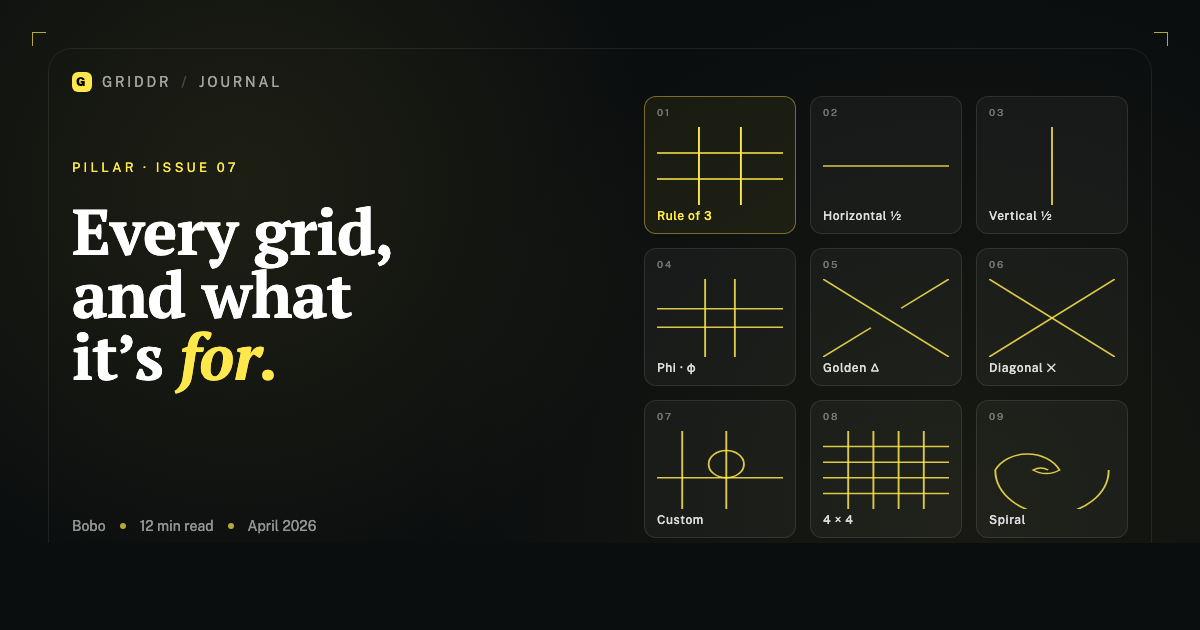
The three things people mean
When someone says "golden ratio in photography," they're usually talking about one of three different things, and the three are wildly different in usefulness.
The Fibonacci spiral. A spiral you overlay on the frame and try to match a curve in the photo to. Honestly: this is the weakest of the three. It's a fun overlay to play with after the shot, but it's nearly impossible to compose with in real time. A spiral has direction and a starting point, and matching both to a moving subject is a coin flip.
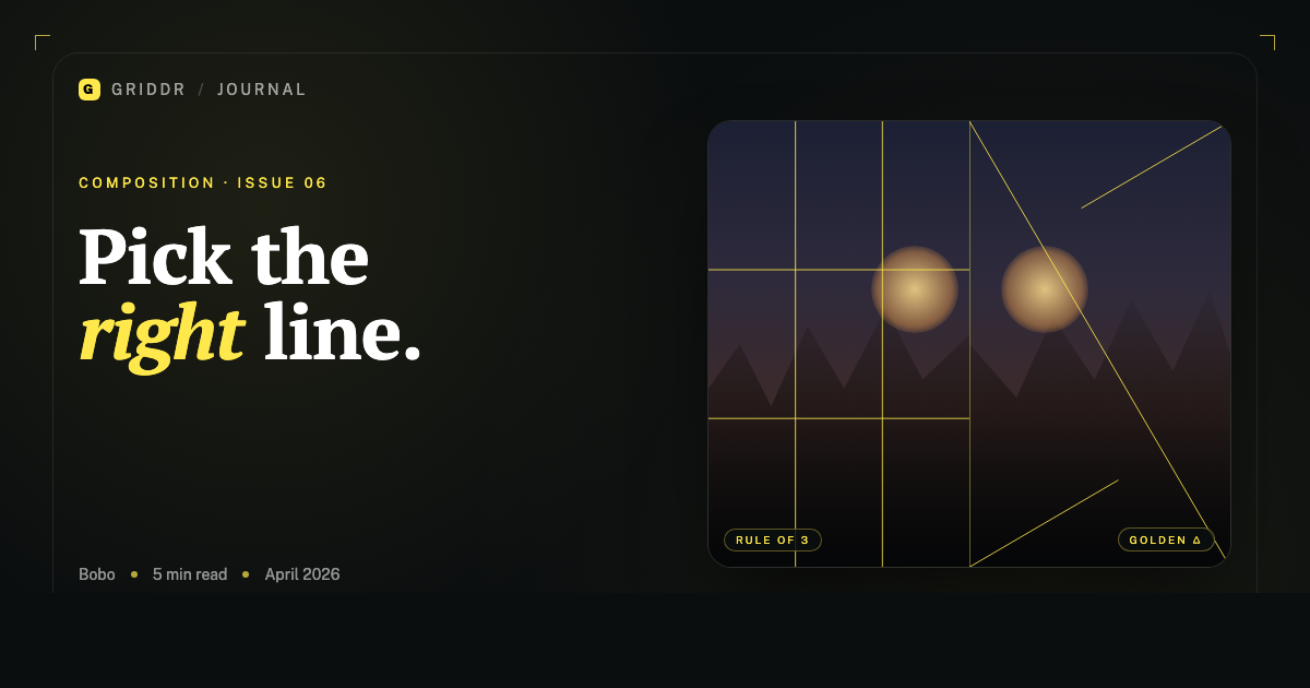
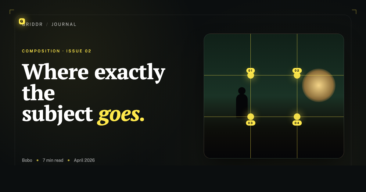
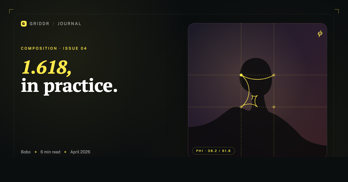
The phi grid. Like rule of thirds, but the lines fall at roughly 38.2% / 61.8% of the frame instead of 33.3% / 66.7%. This one is genuinely useful and is the version I keep on my phone.
The golden triangle. Diagonal lines at golden-ratio angles, used to guide a subject's diagonal motion or place a face along a line of tension. This one is real, and it has its own post.
If you only remember one thing: the phi grid is the actually-useful golden ratio in photography.
Why the phi grid is better than rule of thirds (sometimes)
Rule of thirds puts intersection points 33% in from each corner. The phi grid puts them 38% in. That 5% difference does something specific: it pulls the subject closer to the center, which feels more stable for static subjects, and gives the empty side of the frame a bit more weight, which feels more elegant for landscapes.
Try this side-by-side: shoot the same frame twice, once with the rule-of-thirds overlay and once with the phi grid. Put the subject on the equivalent intersection in each. The phi grid version will feel slightly less designed — less obvious. That's not always better. But for portraits, still life, and anything with a single dominant subject, it usually is.
Rule of thirds is the default because it's easier to teach. Phi is the default for some classical painters for the same reason it works in photos: the intersections sit closer to where the eye actually rests.
Phi is rule of thirds, slightly more elegant and slightly less obvious.
When the spiral does work
I said the Fibonacci spiral is hard to compose with. That's true live. Where it earns its keep is in review — when you're looking at a shot you already took and trying to figure out why it works.
You'll find that great photos often have a curve — a road, a hairline, the edge of a cloud, the curl of a wave — and that curve unwinds from a focal point near a phi-grid intersection. The spiral isn't predicting the photo; it's describing the structure after the fact.
That's still useful. Once you've seen the structure in a few hundred photos you admire, you start anticipating it. You'll find yourself standing on a beach moving three feet to your left so the wave's curl unwinds the way the spiral does. You're not consciously composing for the spiral — you're composing for the curve, and the spiral is one way to remember what a good curve looks like.
What phone photographers should actually do
- Replace rule of thirds with phi for portraits and still life. Same intent, slightly better results. Most camera apps don't ship a phi grid, which is its own argument for custom grids.
- Keep rule of thirds for landscapes and street. The wider 33% line gives you more space to work with when your "subject" is a horizon or a moving person.
- Use the golden triangle for diagonal compositions. Especially street, sports, and any photo where motion matters.
- Treat the spiral as a diagnostic, not a viewfinder. Look at it after, not during.
The ratio that actually matters
If you're shooting a phone in landscape, you're shooting at a 4:3 or 16:9 aspect ratio, neither of which is 1:1.618. The frame itself isn't golden. So when you place a subject on a phi line, you're not invoking some cosmic harmony — you're using a slightly different rule of thirds.
That's fine. The honest version of the golden ratio in photography is: it's a useful default that's a bit closer to the center than rule of thirds. Anyone selling it as more is selling something else.
The math is real. The mysticism is marketing. The phi grid is on my phone every day. The spiral is something I look at when I'm trying to learn from someone else's photo.
Related reading
Shoot this with Griddr
Get Griddr — free on iOS & Android